- Uyumlu XF 2 Sürümleri
- 2.2.X
- 2.0.X
- 2.1.X
Merhabalar, forumunuza hareketli bildirim ve hareketli özel mesaj bildirimi ekleyebilirsiniz. Bildirim geldiğinde hareket eden bir zil ve hareket eden bir shadow ekliyoruz.
Bildirimler alanına animasyon eklemek için kullandığınız temanın
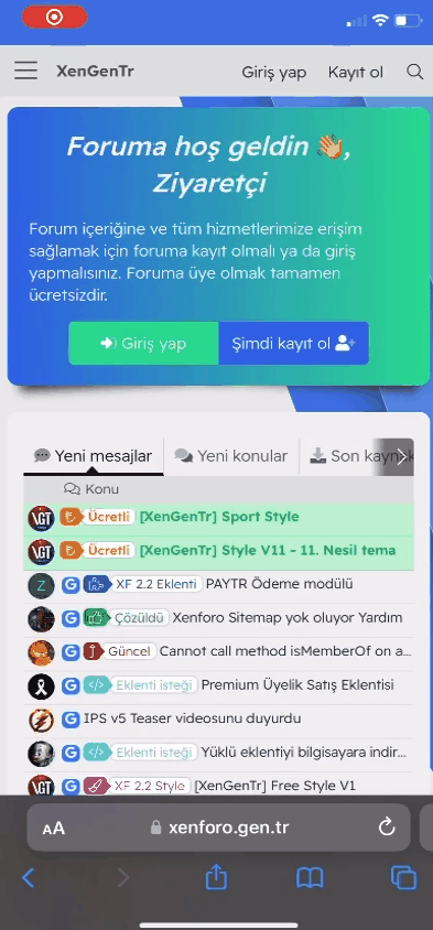
Ekran görüntüsü:

Hem özel mesaj alanına hem de bildirim alanına uygulamak istiyorsanız aşağıdaki kodları ekleyiniz.
[/CODE]
Ekran görüntüsü:
Eğer shadow hareketinin ayrı ayrı hareket etmesini istiyorsanız özel mesaj (DM) animasyonu için aşağıdaki kodları yukarıdaki özel mesaj less kodları yerine kullanabilirsiniz.
Ekran Görüntüsü
Bildirimler alanına animasyon eklemek için kullandığınız temanın
extra.less şablonunu açın ve aşağıdaki kodları ekleyip kayıt edin..
Less:
@keyframes xgtbell {
    0% {
        transform: rotate(0);
    }
    10% {
        transform: rotate(30deg);
    }
    20% {
        transform: rotate(0);
    }
    80% {
        transform: rotate(0);
    }
    90% {
        transform: rotate(-30deg);
    }
    100% {
        transform: rotate(0);
    }
}
@-webkit-keyframes xgtNotificationAnim {
    to {
        box-shadow: 0 0 0 12px rgba(232, 76, 61, 0);
    }
}
@-moz-keyframes xgtNotificationAnim {
    to {
        box-shadow: 0 0 0 12px rgba(232, 76, 61, 0);
    }
}
@-ms-keyframes xgtNotificationAnim {
    to {
        box-shadow: 0 0 0 12px rgba(232, 76, 61, 0);
    }
}
@keyframes xgtNotificationAnim {
    to {
        box-shadow: 0 0 0 12px rgba(232, 76, 61, 0);
    }
}
.js-badge--alerts.badgeContainer--highlighted {
    i {
        &:after {
            animation: xgtbell 1s 1s both infinite;
        }
    }
    border: none;
    box-shadow: 0 0 0 0 rgba(225, 228, 227, 0.7);
    border-radius: 10%;
    background-size: cover;
    background-repeat: no-repeat;
    cursor: pointer;
    -webkit-animation: xgtNotificationAnim 1.25s infinite cubic-bezier(0.66, 0, 0, 1);
    -moz-animation: xgtNotificationAnim 1.25s infinite cubic-bezier(0.66, 0, 0, 1);
    -ms-animation: xgtNotificationAnim 1.25s infinite cubic-bezier(0.66, 0, 0, 1);
    animation: xgtNotificationAnim 1.25s infinite cubic-bezier(0.66, 0, 0, 1);
}
Ekran görüntüsü:
Hem özel mesaj alanına hem de bildirim alanına uygulamak istiyorsanız aşağıdaki kodları ekleyiniz.
Less:
[CODE=less]@keyframes xgtbell {

    0% {
        transform: rotate(0);
    }

    10% {
        transform: rotate(30deg);
    }

    20% {
        transform: rotate(0);
    }

    80% {
        transform: rotate(0);
    }

    90% {
        transform: rotate(-30deg);
    }

    100% {
        transform: rotate(0);
    }

}

@-webkit-keyframes xgtNotificationAnim {
    to {
        box-shadow: 0 0 0 12px rgba(232, 76, 61, 0);
    }
}

@-moz-keyframes xgtNotificationAnim {
    to {
        box-shadow: 0 0 0 12px rgba(232, 76, 61, 0);
    }
}

@-ms-keyframes xgtNotificationAnim {
    to {
        box-shadow: 0 0 0 12px rgba(232, 76, 61, 0);
    }
}

@keyframes xgtNotificationAnim {
    to {
        box-shadow: 0 0 0 12px rgba(232, 76, 61, 0);
    }
}

.badgeContainer--highlighted {
    i {
        &:after {
            animation: xgtbell 1s 1s both infinite;
        }

    }

    border: none;
    box-shadow: 0 0 0 0 rgba(225, 228, 227, 0.7);
    border-radius: 10%;
    background-size: cover;
    background-repeat: no-repeat;
    cursor: pointer;
    -webkit-animation: xgtNotificationAnim 1.25s infinite cubic-bezier(0.66, 0, 0, 1);
    -moz-animation: xgtNotificationAnim 1.25s infinite cubic-bezier(0.66, 0, 0, 1);
    -ms-animation: xgtNotificationAnim 1.25s infinite cubic-bezier(0.66, 0, 0, 1);
    animation: xgtNotificationAnim 1.25s infinite cubic-bezier(0.66, 0, 0, 1);
}Ekran görüntüsü:
Eğer shadow hareketinin ayrı ayrı hareket etmesini istiyorsanız özel mesaj (DM) animasyonu için aşağıdaki kodları yukarıdaki özel mesaj less kodları yerine kullanabilirsiniz.
Less:
@keyframes xgtDM {
    0% {
        transform: rotate(0);
    }
    10% {
        transform: rotate(30deg);
    }
    20% {
        transform: rotate(0);
    }
    80% {
        transform: rotate(0);
    }
    90% {
        transform: rotate(-30deg);
    }
    100% {
        transform: rotate(0);
    }
}
@-webkit-keyframes xgtConversationsAnim {
    to {
        box-shadow: 0 0 0 12px rgba(232, 76, 61, 0);
    }
}
@-moz-keyframes xgtConversationsAnim {
    to {
        box-shadow: 0 0 0 12px rgba(232, 76, 61, 0);
    }
}
@-ms-keyframes xgtConversationsAnim {
    to {
        box-shadow: 0 0 0 12px rgba(232, 76, 61, 0);
    }
}
@keyframes xgtConversationsAnim {
    to {
        box-shadow: 0 0 0 12px rgba(232, 76, 61, 0);
    }
}
.js-badge--conversations.badgeContainer--highlighted {
    i {
        &:after {
            animation: xgtDM 1s 1s both infinite;
        }
    }
    border: none;
    box-shadow: 0 0 0 0 rgba(225, 228, 227, 0.7);
    border-radius: 10%;
    background-size: cover;
    background-repeat: no-repeat;
    cursor: pointer;
    -webkit-animation: xgtConversationsAnim 1.5s infinite cubic-bezier(0.66, 0, 0, 1);
    -moz-animation: xgtConversationsAnim 1.5s infinite cubic-bezier(0.66, 0, 0, 1);
    -ms-animation: xgtConversationsAnim 1.5s infinite cubic-bezier(0.66, 0, 0, 1);
    animation: xgtConversationsAnim 1.5s infinite cubic-bezier(0.66, 0, 0, 1);
}
Ekran Görüntüsü

![[XenGenTr] XenForo İçerik Koruyucu](/data/resource_icons/1/1197.jpg?1713171834)
![[XenGenTr] Kategori Istatistikleri](/data/resource_icons/1/1196.jpg?1713170396)